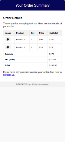
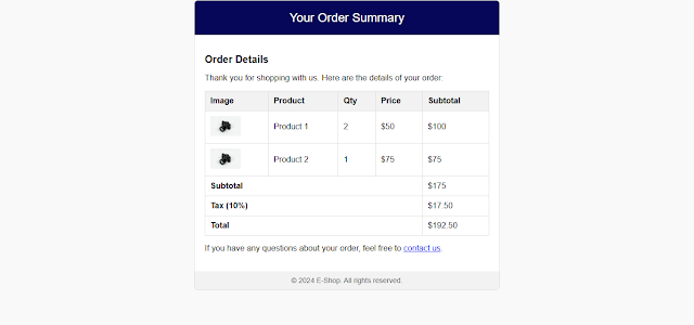
In today's fast-paced digital world, email marketing plays a crucial role in connecting businesses with customers. Whether you're running an e-commerce store or launching a new product, a well-designed email template can significantly enhance customer engagement. In this post, we’ll provide free HTML code for e-commerce emails and discuss why responsive email design is essential for boosting your online store's performance.
Why Use Responsive Email Templates?
Responsive email templates ensure your emails look great across devices like desktops, tablets, and smartphones. Here are some key benefits:
- Improved User Experience: A responsive design adapts seamlessly to different screen sizes.
- Higher Open Rates: Mobile-friendly emails are more likely to be opened by users.
- Increased Conversions: Attractive emails encourage users to make purchases or take action.
- Professional Branding: A visually appealing design reflects your brand's professionalism.
Features of a Great E-Commerce Email Template
A good e-commerce email template should include:
- Eye-Catching Header: Showcase your brand logo and a clear call to action.
- Product Showcase: Include product images, descriptions, and prices.
- Order Summary: Highlight subtotal, tax, and total amount.
- Responsive Design: Ensure the email is mobile-friendly.
- Footer Information: Add social media links, contact details, and terms.
Free HTML Code for E-Commerce Emails
Below is a responsive HTML email template you can use for your e-commerce store:
<!DOCTYPE html>
<html>
<head>
<meta charset="UTF-8">
<meta name="viewport" content="width=device-width, initial-scale=1.0">
<style>
body {
font-family: Arial, sans-serif;
margin: 0;
padding: 0;
background-color: #f4f4f4;
}
.email-container {
max-width: 600px;
margin: 20px auto;
background-color: #ffffff;
border: 1px solid #dddddd;
border-radius: 8px;
overflow: hidden;
}
.header {
background-color: #007bff;
color: white;
text-align: center;
padding: 20px;
font-size: 24px;
}
.content {
padding: 20px;
}
.content h2 {
font-size: 20px;
color: #333;
}
.product-table {
width: 100%;
border-collapse: collapse;
margin-top: 10px;
}
.product-table th, .product-table td {
border: 1px solid #ddd;
padding: 10px;
text-align: left;
}
.product-table th {
background-color: #f4f4f4;
}
.product-image {
max-width: 50px;
}
.total {
font-weight: bold;
text-align: right;
}
.footer {
background-color: #f4f4f4;
text-align: center;
padding: 10px;
font-size: 14px;
color: #555;
}
</style>
</head>
<body>
<div class="email-container">
<!-- Header -->
<div class="header">
Your Order Receipt
</div>
<!-- Content -->
<div class="content">
<h2>Thank You for Your Purchase!</h2>
<p>Here is the summary of your order:</p>
<!-- Product Table -->
<table class="product-table">
<thead>
<tr>
<th>Product</th>
<th>Qty</th>
<th>Price</th>
<th>Subtotal</th>
</tr>
</thead>
<tbody>
<tr>
<td><img src="https://via.placeholder.com/50" class="product-image" alt="Product 1"> Product 1</td>
<td>2</td>
<td>$25</td>
<td>$50</td>
</tr>
<tr>
<td><img src="https://via.placeholder.com/50" class="product-image" alt="Product 2"> Product 2</td>
<td>1</td>
<td>$40</td>
<td>$40</td>
</tr>
</tbody>
<tfoot>
<tr>
<td colspan="3" class="total">Subtotal:</td>
<td>$90</td>
</tr>
<tr>
<td colspan="3" class="total">Tax (10%):</td>
<td>$9</td>
</tr>
<tr>
<td colspan="3" class="total">Total:</td>
<td>$99</td>
</tr>
</tfoot>
</table>
</div>
<!-- Footer -->
<div class="footer">
© 2024 Your Brand. All rights reserved.<br>
<a href="#">Privacy Policy</a> | <a href="#">Contact Us</a>
</div>
</div>
</body>
</html>
How to Use This Code
- Copy the above HTML and paste it into your email campaign editor.
- Replace placeholder images (
https://via.placeholder.com/50) with your product images. - Update product details, prices, and links dynamically if you’re integrating with a backend system.
Tips for Effective Email Campaigns
- Personalize Your Emails: Address customers by their first name.
- A/B Testing: Test different subject lines and email designs to see what performs better.
- Optimize for Mobile: Ensure your emails are mobile-friendly, as most users check emails on their phones.
- Clear CTA: Use strong call-to-action buttons like "Shop Now" or "View Details."
- Follow-up Emails: Send follow-ups for abandoned carts or product recommendations.


.png)
.png)